

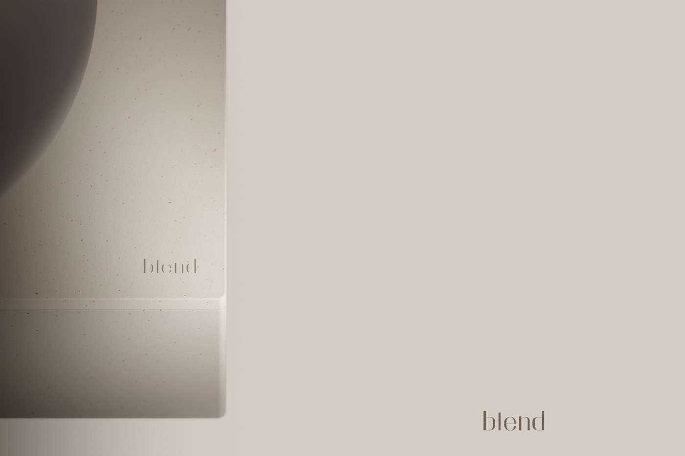
blend _ Natural home appliance brand(2023)
'blend' is a living home appliance brand that pursues 'natural harmony'.

Brand name & concept
Just as natural elements come together to form a beautiful landscape,
"blend" imagines that home appliances harmonize within a natural home interior without harming it.
"blend" imagines that home appliances harmonize within a natural home interior without harming it.

Logo _ Modern camouflage
The naming and logo of "blend" is an idea derived from the brand's key keyword, "natural harmony."
Rather than revealing its presence in any background, it was intended to blend naturally with that background.
It's designed to bring out the modern font feel, but when you appreciate the brand's products,
including the logo, the brand's logo is mixed with the product as if it were camouflaged.
Rather than revealing its presence in any background, it was intended to blend naturally with that background.
It's designed to bring out the modern font feel, but when you appreciate the brand's products,
including the logo, the brand's logo is mixed with the product as if it were camouflaged.
CMF Strategy
The CMF of product will be applied with neutral tones of color and a material with some particles

"blend" imagines that home appliances harmonize within a natural home interior
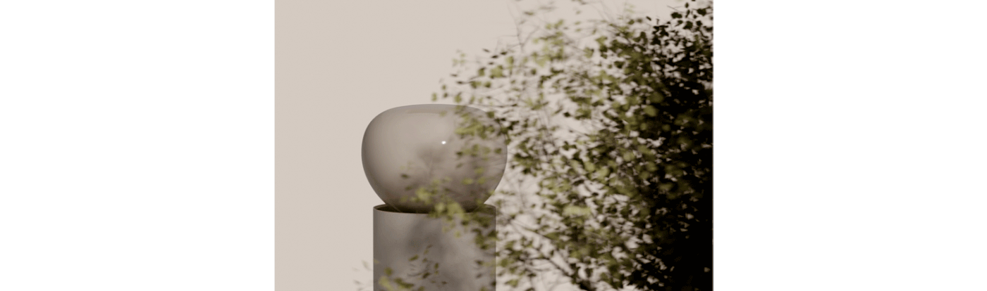
landscape image : photographer_petros koublis


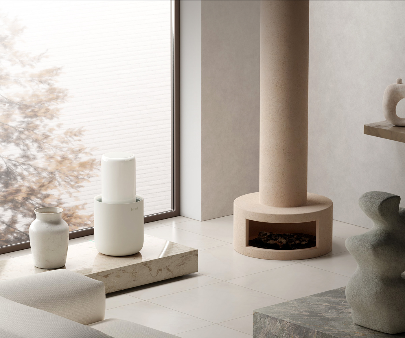
The first product to be released in blend is a humidifier.
Based on this brand's philosophy, we conducted a design study of the product to be released in 2024.
The first product to be released in blend is a humidifier that evaporates water through the wind.
The first product to be released in blend is a humidifier that evaporates water through the wind.


"In line with Blend's design philosophy, we considered a design that could look like an object
instead of a white appliance. Among the various ideas, We have developed three types of ideas
with improved usability and concept while meeting blend's design philosophy.
instead of a white appliance. Among the various ideas, We have developed three types of ideas
with improved usability and concept while meeting blend's design philosophy.

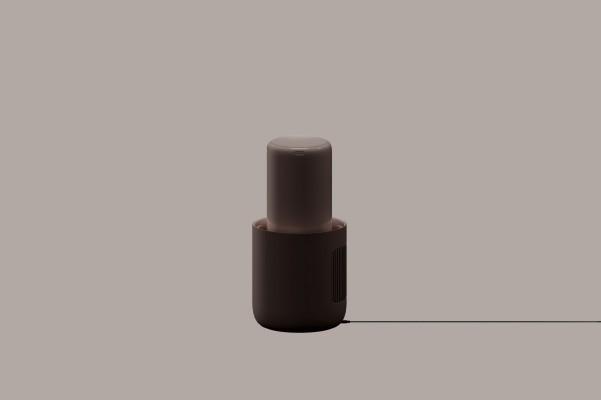
Idea 1. Teum _ doesn't look like humidifier
Most humidifiers take the shape of a large hole in the upper part.
From the brand perspective of 'blend', we intentionally avoided this shape and designed a product that did not look like a humidifier. "Teum" is a Korean word that means a little space between object and object. Using this 'Teum',
we studied the shape and structure that are object-like and can sufficiently function as a humidifier.


Usability is ensured by using a rebound spring.

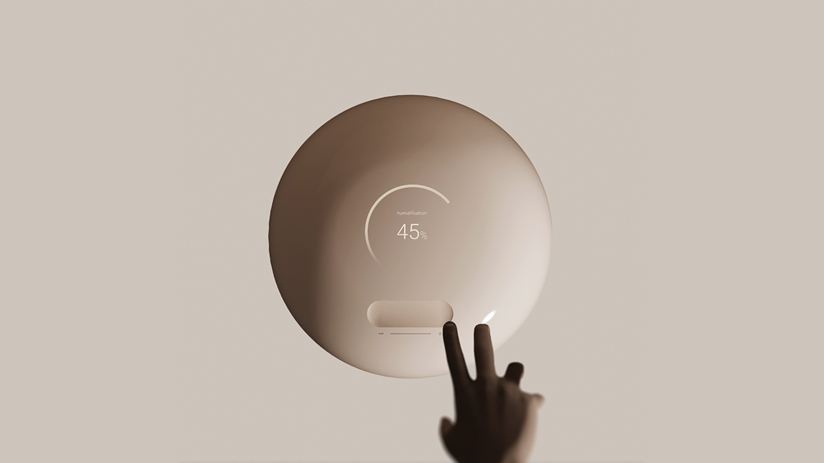
slide touch interaction


Idea 2. Loch _ makes the product easy to manage.
Fogless humidifiers are products that require regular cleaning of humidification filters and water bottles.
Most humidifiers have only a parting line in one mass, making it difficult to disassemble and assemble the product.
From the brand perspective of 'blend', we tried to study the shape that makes it easier to disassemble and assemble the product and at the same time exists in a beautiful shape like an object.


The protruding part of the product functions as a handle and is the core of product aesthetics.


Intuitive interaction using scroll wheel structure

Idea 3. Fountain _ A comfortable meeting with users
The sizes of fogless humidifier products on the market are not higher than people's waists.
For this reason, the user should take a posture carefully or ambiguous posture whenever you use the product.
From the brand perspective of 'blend', we tried to study the forms that can easily be touched by users
solving these inconvenience and exist like beautiful objects in living spaces.
For this reason, the user should take a posture carefully or ambiguous posture whenever you use the product.
From the brand perspective of 'blend', we tried to study the forms that can easily be touched by users
solving these inconvenience and exist like beautiful objects in living spaces.

The high-rise screen interface is a consideration for the user's posture.

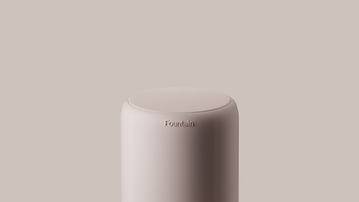


The components of the product are designed in one language that does not break the harmony.


blend _ Natural home appliance design study (2023)
branding. product design. 3d rendering
designer _ lee eui ju (object with name)
Client_blend corporation
designer _ lee eui ju (object with name)
Client_blend corporation
Mail - leeeuiju20@naver.com
instagram - industrial imagination
special thanks for seong hyeon Hwang
© Object with name 2024


